
Sparkling water is incredibly popular, with many offerings from small local companies and multinational brands. It is fun to explore the different visual styles and interesting flavor combinations. This is a shot I did recently using the Target brand, Good and Gather.
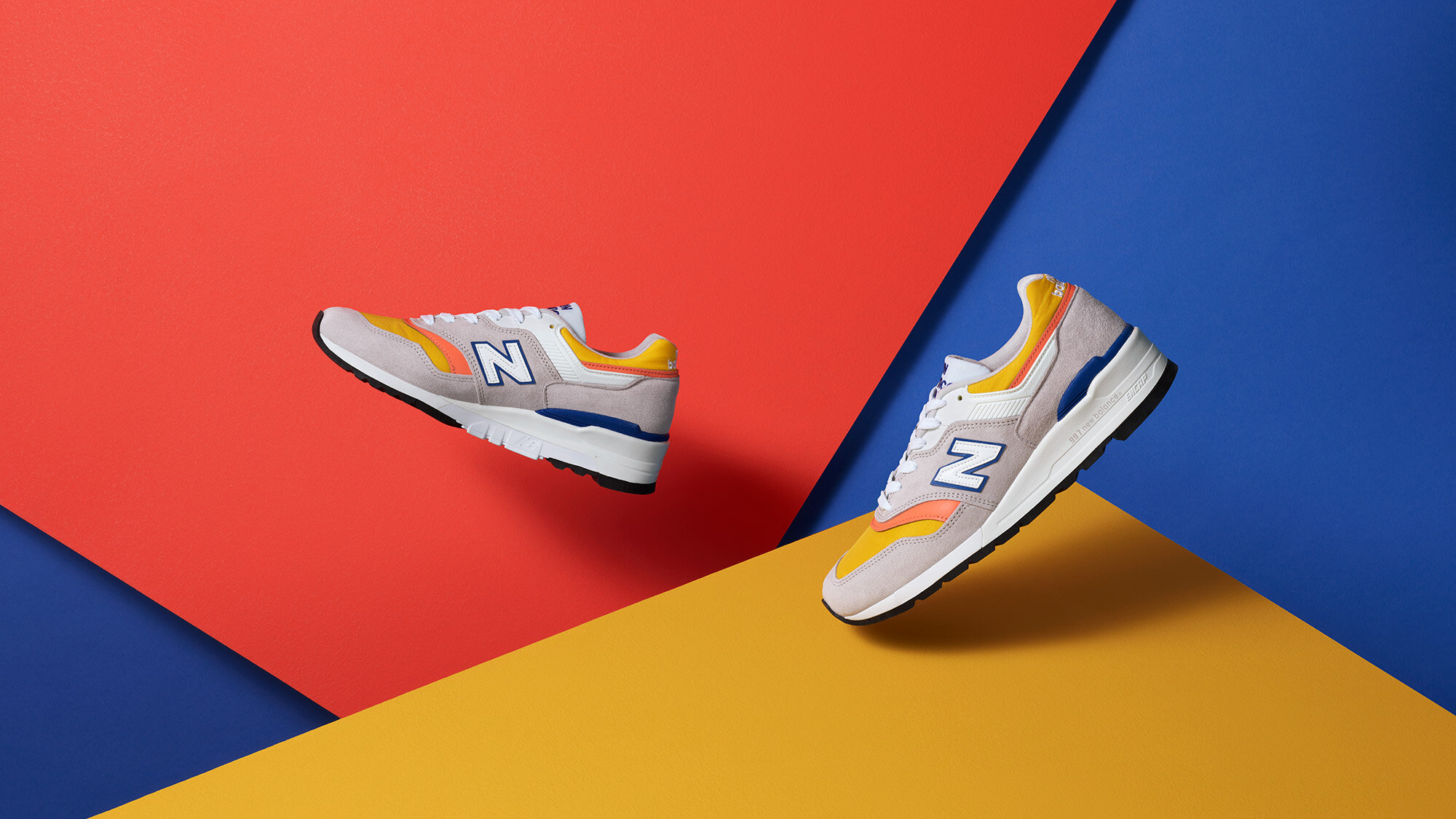
Colorful Shoes
I was excited to photograph these vibrant and cheerful New Balance shoes. I knew the image should reflect their playful energy. I used planes of color inspired by the shoes to create the composition. Initially, I had white behind the yellow and orange, but I ultimately swapped it for a bright blue paper which helped everything pop.


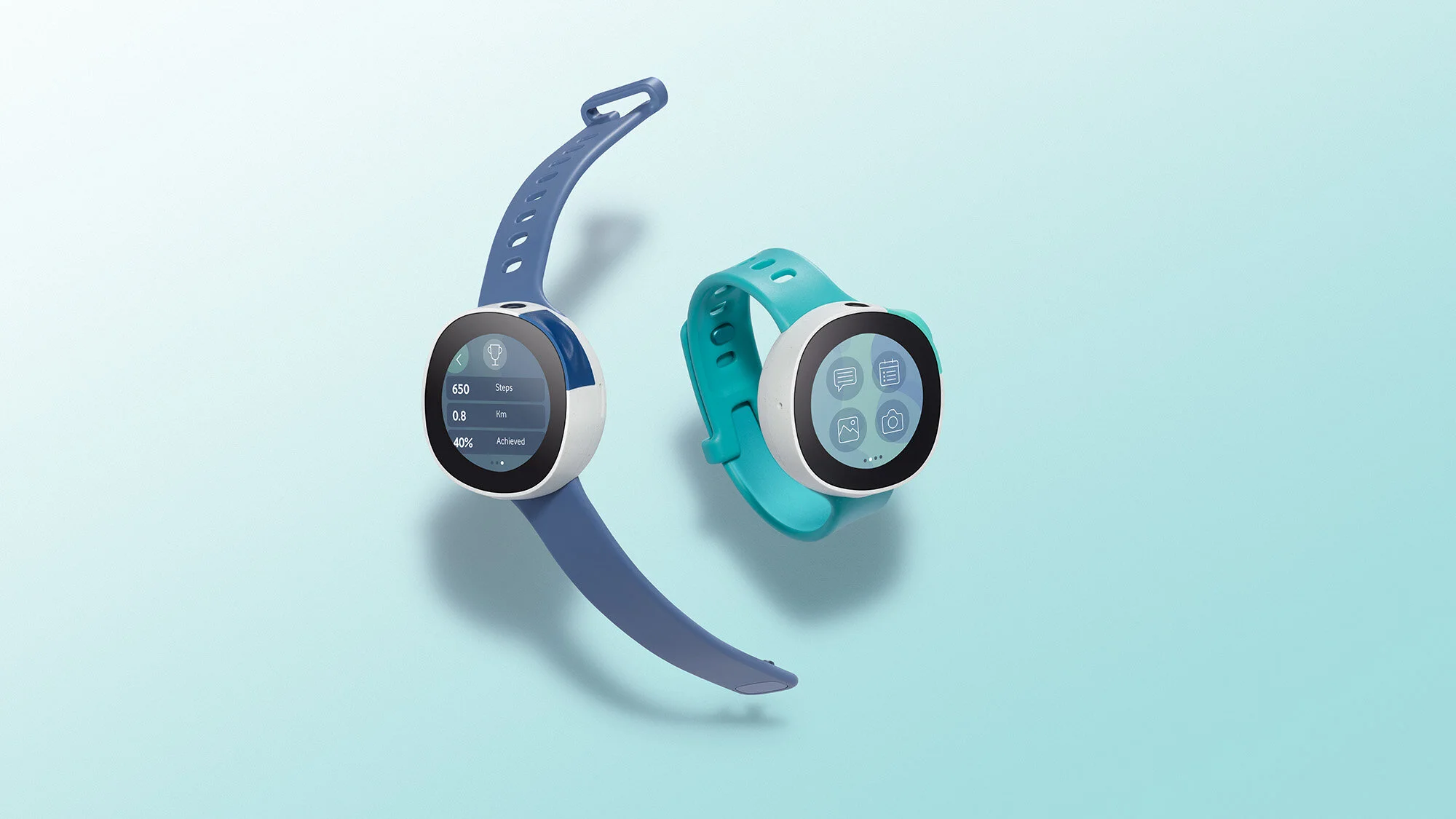
Vodafone Neo
I worked with the design team at Fuseproject to capture images for the launch of the Vodafone Neo, a smartwatch for kids.
Even with COVID-19 limitations, we were still able to collaborate in real time with my remote setup. We kept the crew to just me and one assistant. We both had masks on all day and followed safety protocols. The client joined via Zoom, which is my choice for remote working. One important feature of Zoom vs. similar software is that with Zoom you can turn off auto exposure, which can be a problem in a dark studio. My setup has become more elaborate the longer we are in this pandemic. Figuring out how to constantly improve things has been fun.


Coway Purifier
Air purifiers have become an important part of our lives. I worked with the team at Fuesproject to capture images of the new purifier they designed with Coway. The purpose of the shoot was not only to show off how stylish it is, but the controls, phone charging, and that it comes in two colors. We created a 3 wall set in my studio to photograph the product.


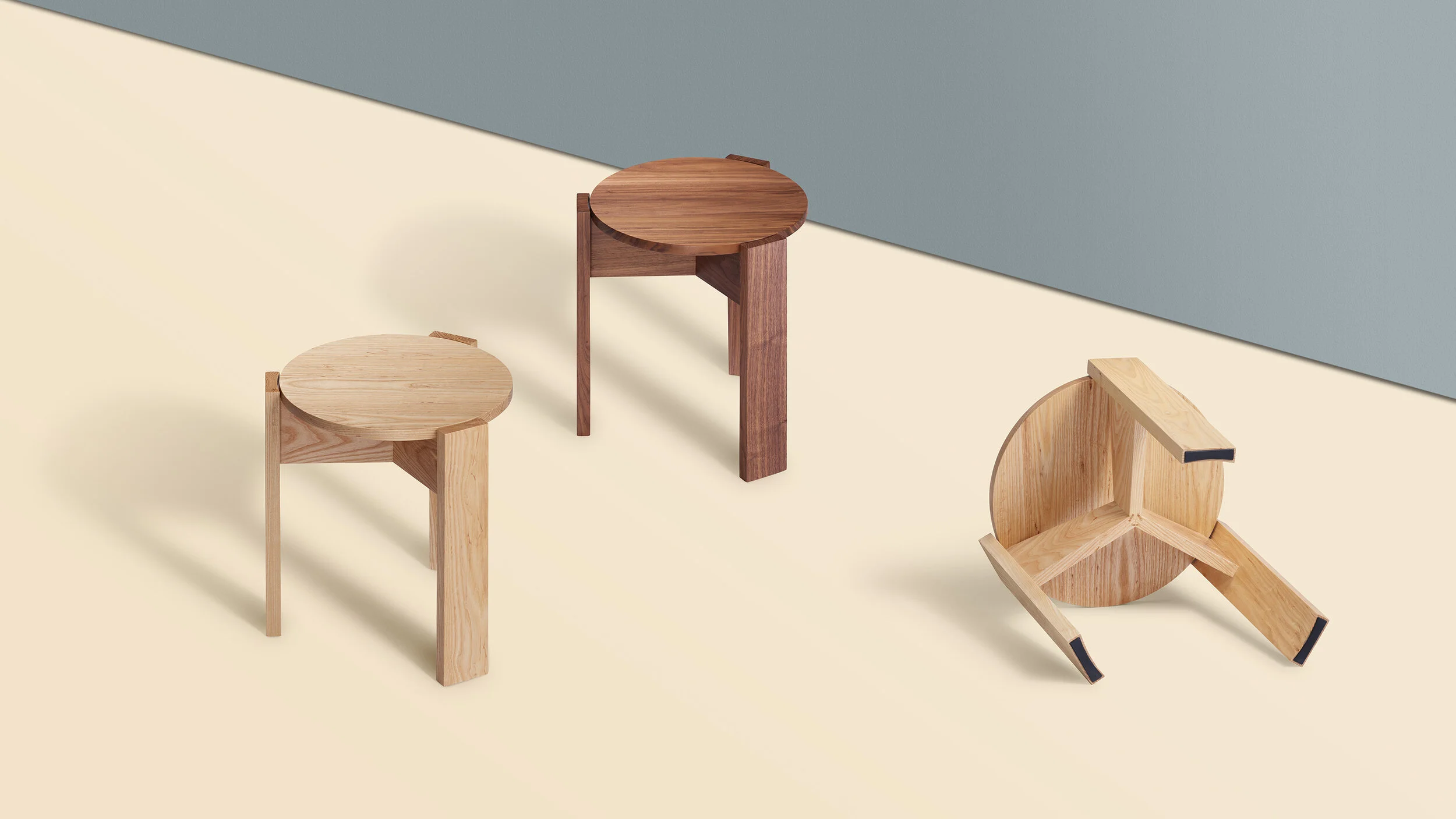
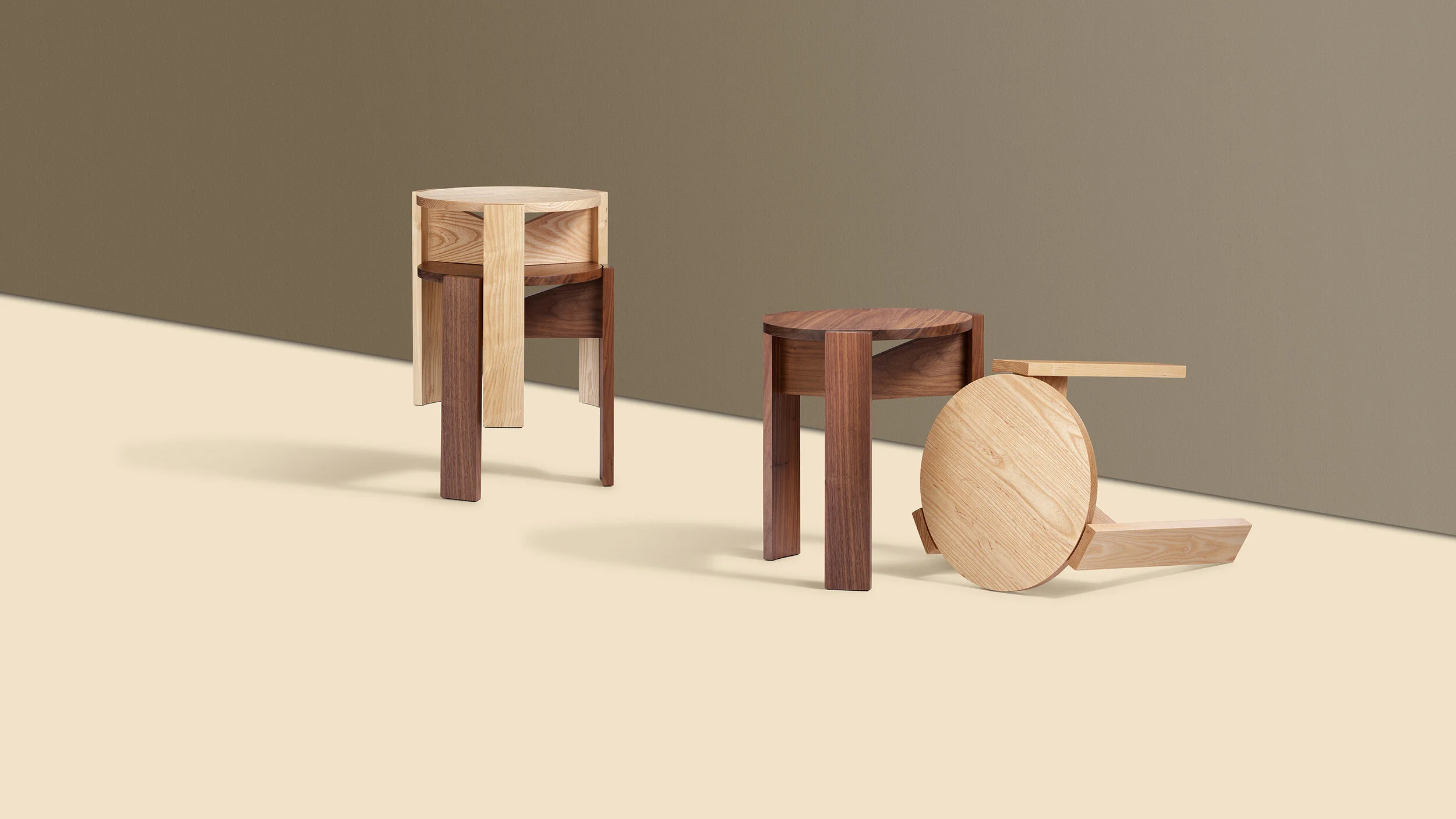
Remote Shooting with Memo Furniture
Even with the restrictions of the pandemic I found a way to work with Memo Furniture, which is located in Seattle, Washington. They shipped the product to my studio while the client joined remotely in real-time. The art director was able to view my capture session as it was happening via the capture software that I use (Capture One). This is a better method than using a screen sharing software, because it allows the client to view all the shots, rate and enlarge the detail of a photo without interrupting my workflow. We communicated view Zoom when needed, but the client preferred to communicate via text and calling. We were able to fine tune the details and collaborate easily. I imagine this could appeal to clients even after the restrictions ease.
The final client shots were all on white. I had some fun exploring color backgrounds for these.


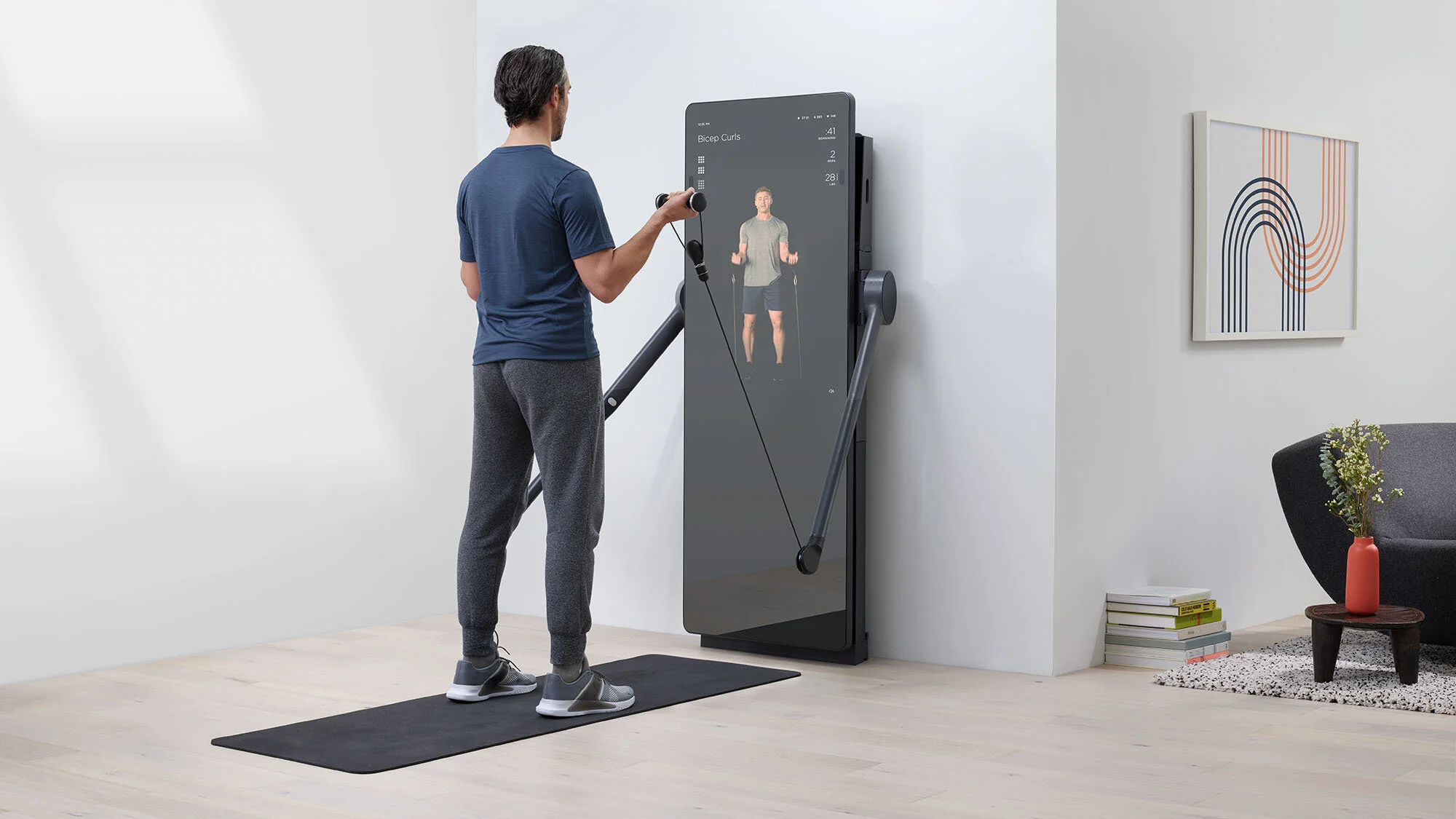
Forme Life
Before sheltering in place, I worked with Forme Life to create photos of their new AI-powered mirror fitness system. We built a living room set in my studio so we could capture two angles of the mirror. The set required four walls and lots of flooring. We had one day to create the set and one day to shoot. You can read more about the mirror and Forme Life in an article on CNN.
I wish I had one of these in my home right about now!


Wired Magazine
It’s great to start off the new year with 8 pages in the January issue of Wired Magazine. The feature was about snow gear and things to keep you cozy in the winter. I really enjoyed collaborating with the talented Wired team on set. Once we get a basic idea of the photo arrangement the designer on set uses a jpeg to make a quick mockup of the layout. If they need more room for a large block of text, the block can be modified on the fly or we can move the props around on set. It’s a back and forth process that works out really well in the end.
Read the full article over at wired.com.


Ticktock
A new addition to my portfolio. For this project the idea was to create a fun still image along with creating a short stop-motion for social media. The motion was to show not only the front but the back of the clock which is also well designed.
The clock was made by TAIT Design Co. They are a cool design studio out of Detroit Michigan. Their clocks are 100% made in the USA, something not easy to do these days.
Sightglass Coffee
Local coffee roaster, Sightglass Coffee, recently redesigned their packaging. I worked with them to create some photos that would show off this new design.

Kala Eyewear
Here’s some work I did for Bay Area made Kala Eyewear. It’s great working with a client that likes to try new things. I was inspired by the lenses of these glasses to create a pattern based off their shape and size. While I was creating the elements I realized that it was reminding me of the cover for the Pet Shop Boys album, Very. The process might look deceptively simple, but it was all built with cut paper and true shadows rather than digitally composited.

In the next photo I was looking to create an abstract face wearing a hat. I liked the contrast of textures with the clean, smooth, white circle. Both concepts add a little playful personality to the frame designs.

Donut Emoji
Donuts are fun to eat and photograph. How I photograph them is always changing, unlike my favorite flavor...glazed.
One series I did involved carrying around 8 foot square photos of donuts mounted onto foam core. I’d place them in surprising locations and take photos of the giant donut posters in their new habitats. There was an appealing contrast of the gritty environments and the large clean colorful donut photos. I really enjoyed doing this but it’s not easy dragging that giant foam core around!
My latest idea is to shrink down the size of the print to fit in my bag. This allows me to be more spontaneous. I decided to make donut emojis for the prints. By placing these small images in new locations the donut emojis take on a anthropomorphic quality.
My donut series work can be seen on instagram @12happydonuts. Be sure to follow for some sweet fun!
Wired
Wired magazine saw the paper cutout photographs I had done for a personal project and asked me to work with them on their June issue. Along with the team at Wired and stylist Grace Suh, we transformed the pages of the Gear Lab section of the magazine. It was a great opportunity to collaborate with a dedicated group of people willing to put the effort into the details. You can read the article online here.
Studio 54
Kala Eyewear designs and hand makes glasses in the San Francisco Bay Area. One of their newest products is a frame inspired by Studio 54. The client needed an image to be used on a large vertical format poster at an upcoming trade show. The only stipulation they gave was to include a disco ball in the shot, which was used to make the patterns on the background. The glasses are positioned in a way to make then feel as if they are dancing the night away.
Geometric Fruit
This recent project is a study of contrasts. The differences in the shapes, colors and texture create a tension and highlight the qualities of each element. Rather than turn to photoshop for the creation of the backgrounds, I cut the shapes out of paper. I wanted the lighting to be real and not a rendered approximation. The paper texture, edges, and spacing between layers are not too perfect, which makes the composition more intriguing. It was really satisfying to concept and then build the backgrounds…choosing the materials and colors and figuring out how to get the cuts the way I wanted.
Sayl Chair
The Sayl chair by Herman Miller has simplified and advanced the desk chair in so many ways. I worked with the chair designers to photograph a new feature of the chair: a fabric back cover. This provides an added level of customization for the user. The goal of this project was to show how the fabric worked with the chair and showcase the color options.
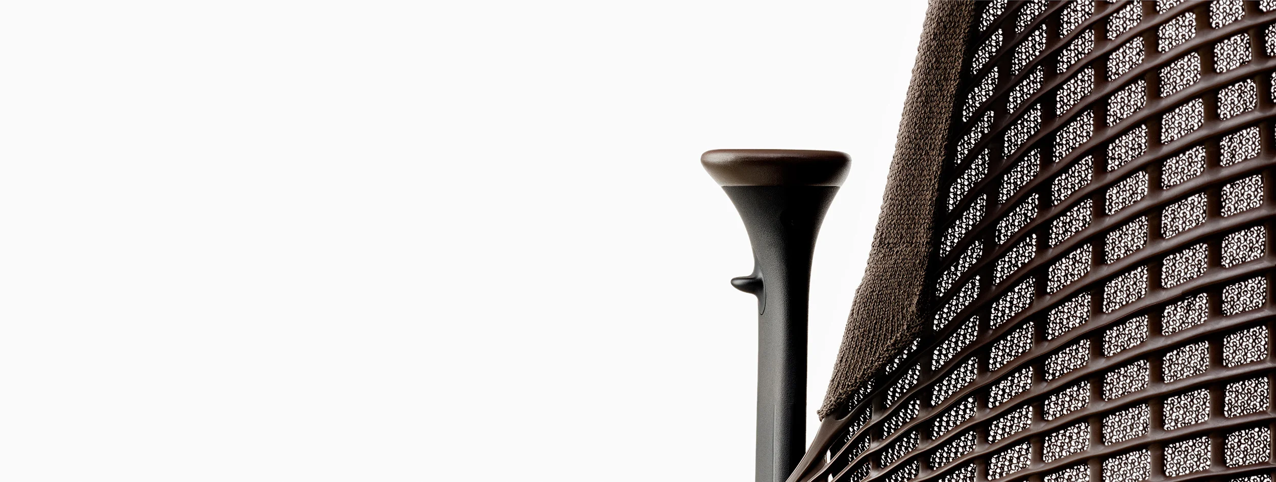
The beauty of the design is that the fabric doesn’t hide the structure’s frameless suspension system. The loose weave of the fabric allows the chair’s back to show through. This quality was something we wanted to capture in the still photos. The stop motion piece allows the viewer to see the chair's shape from all sides as well as demonstrating how many colors combinations there are.
Color
How light reacts to something isn’t always predictable, especially with colored lights. Matte, shiny, and reflective areas all react differently to the incoming color light. The golf clubs I shot recently had all of these types of surfaces in a very small area. I need to think about the finishes as I’m lighting. Finding the right balance between the colored light and neutral light is also important. Using a similar color on the background helped create the feeling that the subject and background are connected and exist in the same space.

Computer History Museum
I was contacted by the Computer History Museum in Mountain View to use a photograph of mine in one of their exhibits. The subject of the show is the iPhone — it's history and impact on the world. It's a celebration of the 10th anniversary of the release of the iPhone.
At the initial release I was photographing the event and caught this shot of Steve Jobs gazing into the treasure-like case that held the first generation of the iPhone.
The museum features the photo in a display that is in their lobby. It was great to see how they curated the exhibit. I can't believe it's been 10 years!
Kala Eyewear
It is amazing how something as simple as a pair of glasses can completely change your look, whether you wear them everyday or just when the sun is out. I wear glasses by necessity and really appreciate a well-crafted pair. That is one reason I love Kala Eyewear. Their glasses are made by hand here in the Bay Area which is another reason. I got the chance to photograph two styles: Twiggy and Mick. Each pair is a piece of art with the potential to transform individuals. I wanted to showcase them as such so I built simple risers to create a graphic scene which would highlight the design and quality details. See their whole collection here: kalaeyewear.com
Hot Fruit
I teamed up with Amanda Hughes-Watkins and some of her colleagues from Hot Fruit to produce some imagery for their website. Hot Fruit is a series of events that connect women professionals with other like minded "Fruits" in a variety of fields. They had a great vision for the look and content of the photos and I was happy to help harvest the imagery. The direction was unique with exotic fruits, sweet wines, shapely greenery, and a delicious color palette. I think the images we created are rich and painterly. It was a fun shoot and great to collaborate with this bunch. Go to www.hotfruit.us.
Millie Lottie
Millie Lottie has taken totes to the next level. Jan Hammock, the owner of Millie Lottie, wanted to show that these bags were more than just a stylish tote bag and that they had clever features to make transporting foods much easier.
I worked with Jan to create simple sketches in a storyboard format showing the different camera angles I would use and what action would be taking place in each shot. I had to think about what the finished video would show and how it would piece together in editing. I needed to highlight the individual parts of the interior of the bag and how it simplifies bringing food to a pot luck or picnic.